Why the pandemic’s data can be misleading
It is imperative to recognize the limitations of the mathematical models with which experts are analyzing scenarios and forecasting the potential death toll of the coronavirus pandemic. The limitations of these models and the wide degree of uncertainty in the forecasts need to be transparently communicated and explained; here again the media are doing a disastrous disservice to society, in some cases abetted by the experts themselves.

On March 16th, the Imperial College London on the impact of the pandemic. The headline takeaway was that absent a response to limit contagion, the covid-19 epidemic would kill over 500,000 people in the UK and 2.2 million in the US, “not accounting for the potential negative effects of health systems being overwhelmed on mortality”. In other words, the death toll would probably exceed those already staggering numbers.
The argued that mitigation—case isolations, quarantines, closing schools and universities and social distancing for the elderly—is “unlikely to be a viable option without overwhelming health care systems” and would therefore at best reduce the death toll in half, implying 250,000 deaths in the UK and over 1 million in the US.
The report therefore called for “suppression” measures, i.e. social distancing for the entire population, the lockdown now in place in the UK and several other countries, and warned these measures would need to be kept in place for 18 months or more to avoid a rebound in contagion.
The 500,000 and 2.2 million deaths projections were widely reported in the press, contributing to a sense of impending global doom. They were also cited by several governments as they placed their countries in partial or total lockdown.
On March 25th Prof. Neil Ferguson, the leading expert behind the report, told the UK Parliament’s Science and Technology Committee he now expects the death toll in the UK will be limited to about 20,000—at most—and that one-half to two-thirds of those would probably have died anyway because of their poor health conditions.
And so the projected UK death toll from covid-19 dropped from half a million to 7-10,000 less than ten days after the alarming initial forecasts.
As far as I can tell from Prof. Ferguson’s testimony, there are two reasons for this:
1. The UK National Health Service has updated its forecasts on the number of beds and ICU units it can bring online, so that now Prof Ferguson and his team project the health care system’s capacity will not be overwhelmed, but at worst stretched in some areas.
2. The lockdown implemented by the UK government will suppress contagion.
Fair enough. However, in his discussion with the Committee Prof. Ferguson recognized that the current lockdown cannot be kept in place for 18 months and warned of a possible second wave of contagion—and it’s not clear to me whether that is consistent with his new 20,000 forecast.
A third possible reason for expecting a lower number might be the one highlighted Thursday by Dr. Deborah Birx, response coordinator for the White House Coronavirus Task Force: In her words, “the predictions of the model don’t match the reality on the ground in China, South Korea or Italy. So either we are measuring the iceberg and underneath it, are a large group of people [who have not needed hospitalization]. […] Or we have the transmission completely wrong.” (Most of the media outlets predictably ignored her and zeroed in on Dr. Fauci’s warning of a possible second wave of contagion.)
A different model developed by an Oxford University team led by Dr. Sunetra Gupta, an epidemiologist, suggests that indeed the virus could have been in the UK since January and could have already infected as much as half of the population—in which case both the share of infected people needing hospitalization and the mortality rate would be substantially lower than official estimates. The report received limited media attention, as it does not play into the Armageddon narrative.
Dr. Gupta says her results are at least as plausible as those of Imperial College. Dr. Ferguson disagrees. I lean towards the Oxford model because I find it hard to believe—as I wrote last week—that the virus shows up in a country only when you start testing for it.
But the fact is we just don’t know. We have not tested enough.
This in my view bolsters the case that countries need to speed up testing, and they need to test representative samples of the population. Wider and statistically representative testing is crucial for two reasons:
1. Wide testing and contact tracing have helped bring contagion under control in Korea and in the Italian region of Veneto, which suffered an outbreak at the same time as Lombardy but now has mortality and positivity rates that are 3-4 times lower (Luigi Zingales details the Veneto case in this article).
2. Only wide and statistically representative testing can get a more precise picture of how infectious the virus is, and give us more reliable estimates of the mortality rate and the share of infected people who require emergency care. This information is essential to design a strategy that allows us to gradually reopen our economies while protecting public health—before the economic damage becomes disproportionate.
A final point I want to discuss, again regarding the quality of data:
In the UK, as mentioned above, Professor Ferguson now expects “only” 20,000 people will die of coronavirus, but adds that one-half to two-thirds of them would die anyway, even without a coronavirus outbreak.
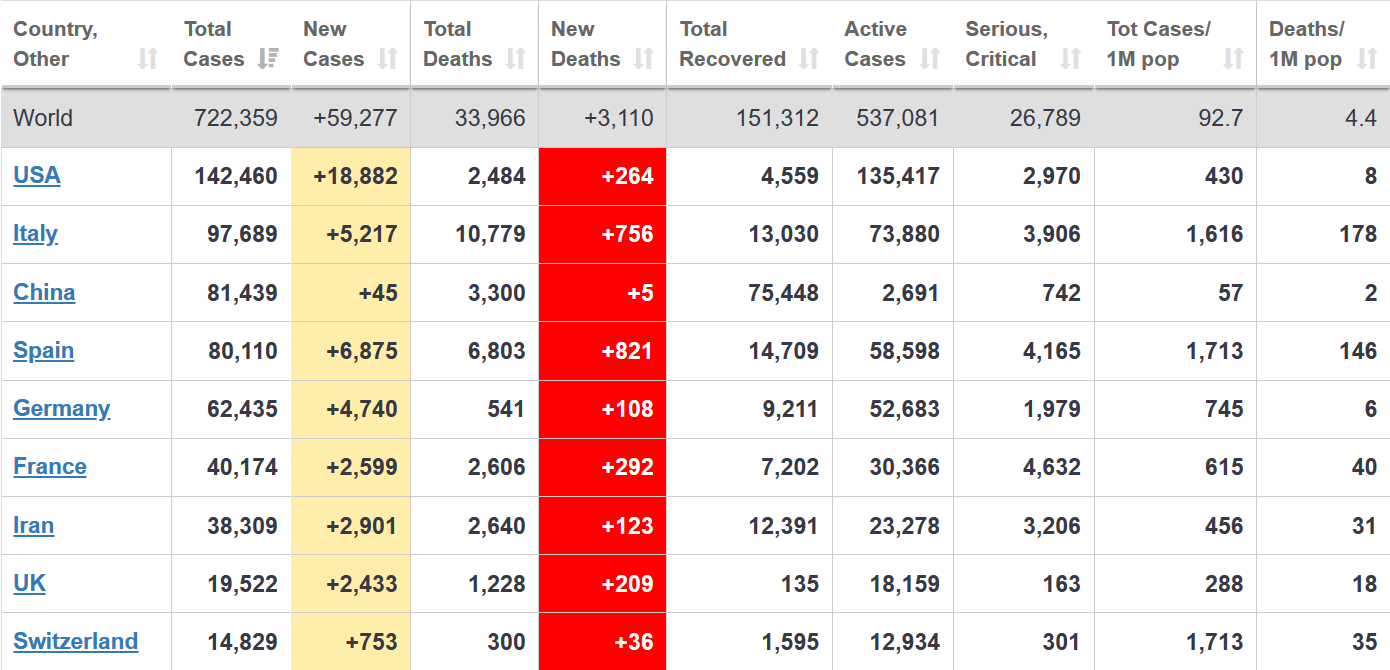
In Italy, Professor Ricciardi, advisor to the Ministry of Health, said that currently all patients who die while covid-positive are recorded as having died because of covid; but that “On re-evaluation by the National Institute of Health, only 12 per cent of death certificates have shown a direct causality from coronavirus, while 88 per cent of patients who have died have at least one pre-morbidity – many had two or three.” Stop and consider this for a moment. It implies that if “direct causality” is the right criterion, as of yesterday (28 March), Italy had about 1,200 coronavirus deaths, not 10,000—which would imply a mortality rate of 1.3% instead of 11%. This is a gigantic difference. The 1.3% would be in line with current estimates in the US and Korea.
This question of how fatalities are counted is similar to what happens with the flu—bear with me, I promise I will not argue that covid-19 is just like the flu.
In the case of the flu, most victims have pre-existing health conditions; the flu weakens their immune system further, leading to death. Official sources say that on average, every year in Italy the flu causes about 8,000 deaths. Of these, only a few hundred are officially attributed to the flu by the national statistical institute (ISTAT), because “the flu virus has not been tested for or not identified, or because the death is ascribed to generic pneumonia”. You get to the 8,000 number by monitoring (i) direct indications of how severe the flu season is; and (ii) “excess mortality”, i.e. the extent to which observed mortality exceeds historical averages. In other words, if they see a bad flu season and an increase in mortality, health experts reasonably estimate that the flu is indirectly responsible for a significant share of the additional deaths.
This excess mortality can be a lot higher than the average 8,000. A 2019 study by Rosano et al estimates that the flu caused excess deaths of 25,000 in the 2016/17 season (as well as of 7,000 in 2013/14, 20,000 in 2014/15, and 16,000 in 2015/16). Another 2019 study by Nielsen et al estimates that the 2017/18 flu season caused 150,000 excess deaths in Europe.
These are huge numbers and they raise two issues:
First and most important, we need to understand how we are counting fatalities, and if and how we can compare them to other epidemics. Is Italy’s current 10,000 covid fatality count comparable to the estimated 25,000 attributed to the flu season of three years ago? If we want to understand how much more dangerous covid-19 is, we need to know.
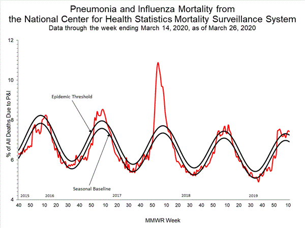
Second: in the case of the flu, experts seem to routinely look at total mortality (on a daily basis in the case of Italy), because they recognize that while we can’t test everyone, if a virus is having a severe impact we should be seeing it in the overall deaths numbers. For covid-19, I have not yet seen anyone explain what is happening to overall mortality. Yet presumably that should give us some indication of what impact covid-19 might have had even before we started testing for it. This is important because we cannot assume the virus showed up just few days before we started testing for it—which instead seems to be the accepted assumption. For the US, the CDC has data for pneumonia and influenza mortality up to March 14: they are elevated, but nowhere near the 2017/18 peak, and lower than the 2016/17 season.

To conclude:
When we feed poor data into mathematical models that are very sensitive to changes in assumptions and parameters, we get projections that have a huge margin of uncertainty. The models are useful. But publicizing the most extreme results without explaining the large margin of error is irresponsible and fuels panic. When the projections then change by a factor of 25 in the space of a week, it fuels further confusion in the public debate.
We need to test more, and we need more clarity on how we are measuring the impact of covid-19—including its fatalities—and to what extent it’s comparable to the way we measure the impact of other viruses.
I know this is hard, but given that the entire debate and the policy response are guided by a determination that covid-19 is much more dangerous than previous viruses, we need more transparency on how that assessment is reached. We urgently need it to decide when and how we can bring our economies back on line while safeguarding public health.
The media will constantly jump on the most apocalyptic forecasts and will ignore caveats, assumptions and scenarios. They want clickbait, and that’s all they seem to care about, with seemingly no concern of how irresponsible this is in the current environment. The experts need to take this into account when they decide how to publicize the results of their studies—their responsibility does not end at the mathematical analysis, it extends to making sure both policymakers and the public get a full and accurate picture.
Here, for the original version of this article
